For the 61 million U.S. adults living with a disability, going online can be a frustrating experience. It is filled with videos that cannot be heard, pictures that cannot be seen, and forms that cannot be completed. But it does not have to be this way. Today, there are tools and resources to empower people of all abilities to navigate the internet as well as contribute to it.
A Brief History of Accessibility
Given that nearly 97% of all homepages have at least one accessibility failure, web accessibility may seem like a new idea but it’s not. For nearly 25 years, legislation has tried to level the digital playing field for people living with disabilities. If your college or university is looking to revamp its website, chances are you’ve heard phrases like Section 508, ADA, and WCAG. Let’s break down what each of them means.
Section 508
Section 508 of the Rehabilitation Act of 1973 requires all federal agencies, and anyone doing business with them, to offer accessible information technology.
ADA
Although not expressly mentioned in the law, web accessibility is also covered under the Americans with Disabilities Act (ADA), which prevents discrimination based on a disability.
WCAG
As the Internet was gaining mass appeal in the late 1990s, the World Wide Web Consortium issued a set of recommendations to help web designers and content creators be accessible. Today, Web Content Accessibility Guidelines (WCAG), are the standard by which websites are evaluated for accessibility.
Why is Web Accessibility Important in Higher Ed?
First, making sure your school is web accessible is the right thing to do. That said, it’s important to consider that nearly 20 percent of college students in the 2015-16 school year reported having a disability and they deserve to learn, create, and access information just like any other student. For colleges that pride themselves on promoting equity and inclusivity, being web accessible is living your brand values.
Failing to be compliant with laws may cost your school millions of dollars. Disability rights advocates have effectively used the court system to force organizations to take action. In 2019 alone, there were 2,256 lawsuits filed for violations of website accessibility. The number of lawsuits spiked during the pandemic when classes moved online. At the time, no one was giving much thought to the effect of uncaptioned Zoom meetings or class slides that didn’t provide alternative text. Schools and plaintiffs sometimes agree to a consent decree–take a look at Harvard’s–but not before spending considerable time and resources.
Web accessibility can also make your website a more creative and effective platform for recruitment. Don’t believe us? Look at search engine optimization. It is a great tool for higher ed digital marketers looking to improve their school web search rankings to generate more views on their admissions pages. Best practices in SEO, such as video captions, descriptive URL links, and organized headings, are also best practices in accessibility.
What are Common Issues in Web Accessibility?
Complying with web accessibility may sound like a behemoth task, and it’s true that the WCAG guidelines are not the easiest to understand. Still, there are simple fixes that can make a big difference for your students. According to WebAIM, 96.5% of all accessibility errors are caused by one of the following issues:
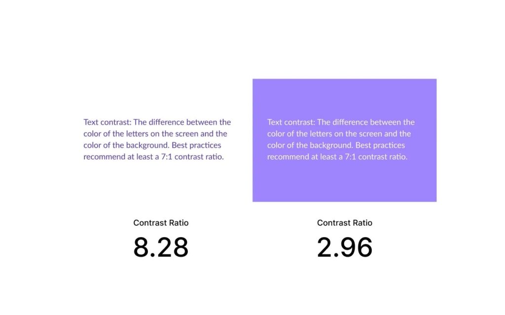
Text contrast: The difference between the color of the letters on the screen and the color of the background. Best practices recommend at least a 7:1 contrast ratio.
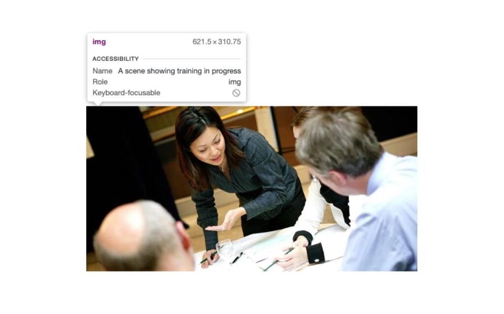
Alt text: Every visual element on a website needs some text that describes what is happening in the image.
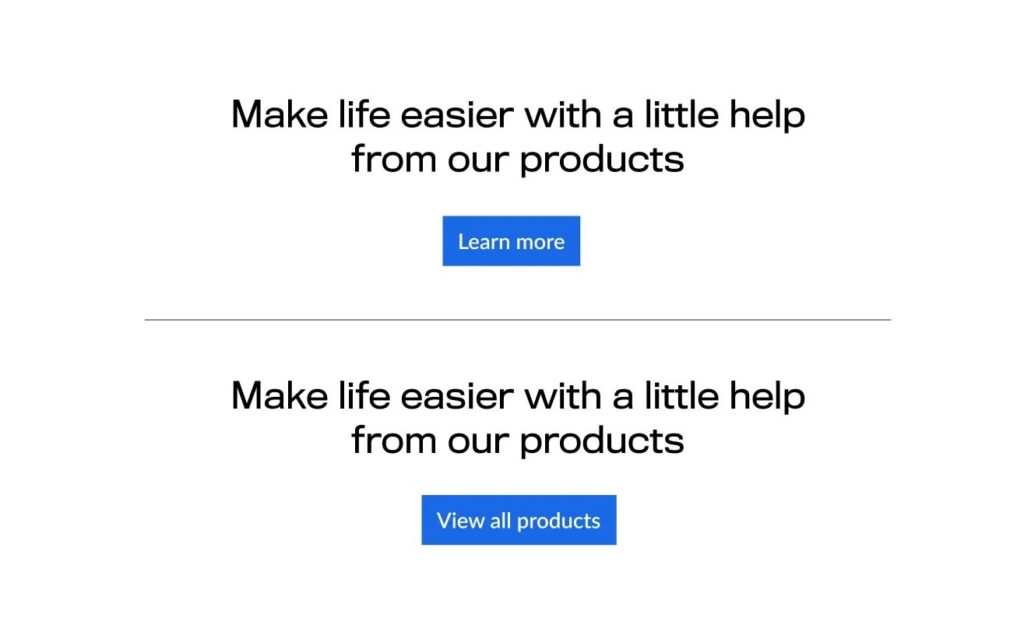
Links and buttons: All links and buttons need to include text that provides context for the link. “Click here” buttons and using your school’s logo as a link without providing any descriptive text are examples of empty links and buttons.
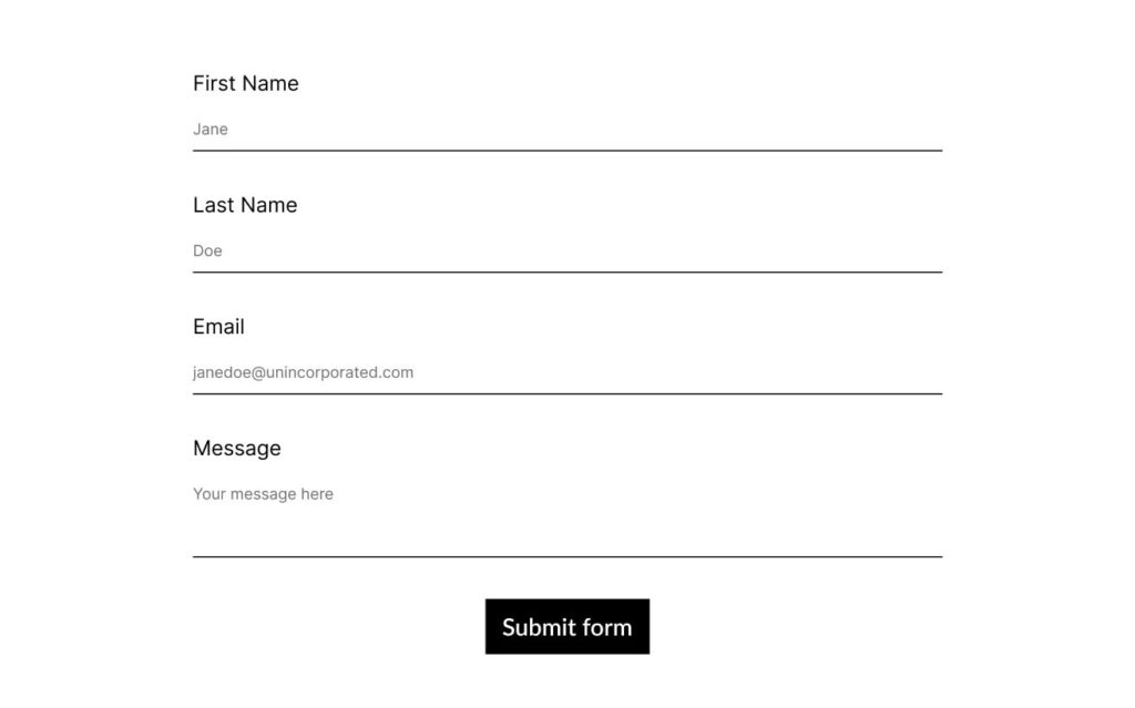
Labels on forms: Every form posted online needs to have labels (e.g., first name, last name, home address) so that they can be read by screen readers.
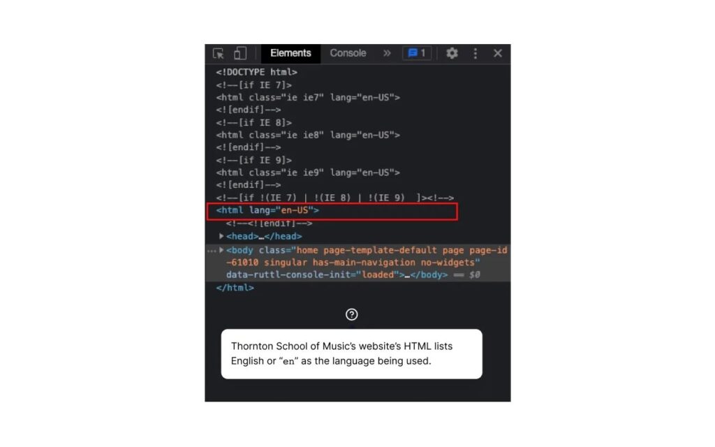
Document language: A website’s HTML should clearly list the language being used. Some screen readers are capable of “speaking” different languages. By adding this simple line of code, these devices can easily “decide” what language to use.
These three options are important, but there are many other enhancements you could make to your college website, including adding chatbots, responsive design, and video stories. To make the biggest impact on your website upgrade, take a deep dive into your school’s student demographics, examine website analytics, and survey the campus community on their user experience.
Now that you know more about the history of web accessibility, the importance of following current standards, and some of the common accessibility mistakes, it’s time to take the next step and ensure your website meets the needs of all students. Doing so may be complicated, but will help drive student enrollment and retention.
Need help with accessibility?
At UNINCORPORATED, our staff of inclusive web designers and marketers know that websites and storytelling can be both engaging and accessible. If you need help with making your website (or any digital media) more accessible, reach out today. If you’re not yet sure if your website is or is not accessible, contact us for a free homepage accessibility audit, and we’ll let you know how your site is doing.
